Since Mibbu framework supports CSS animations, it's good moment to create version exclusively for mobile devices, without using heavy and hard to render canvas, and with very limited JavaScript DOM interactions - CSS FTW! So I remove about 50% of code from original branch and test it on my Samsung Wave (bada has one of the best mobile browsers ever, so that was my starting point). And it simply doesn't work:
After short research I saw that Allegro ('Polish Ebay') had the same problem on Desktop Chrome months ago. After couple more hours of reading documentation I found a clue, that Webkit is freaking out if you try to put HTML content into style tag. So I switch
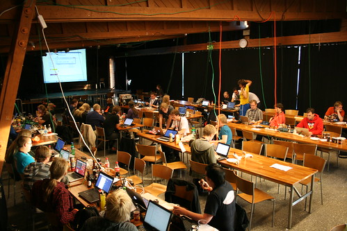
Last week Mozilla together with Finnish demoscene hackers organized Flame Party in capital of Finland, Helsinki. More than 100 participants worked whole day on outstanding web demos in two main categories - Single Effect and Main Demo. Because of nearly release of stable Firefox 5, first Mozilla's browser with CSS3 Animation support, I decide to create CSS3 demo for the Single Effect Compo.
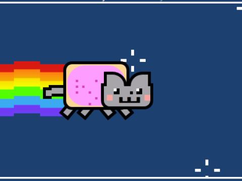
Since I really enjoy all that 4chan-like mems stuff, I chose Nyan Cat, as one of the most 'fresh' ones. In case you don't know it (check the progress bar!):
I didn't use any graphics to code my CSS Nyan Cat. It is completely drawn and animated in CSS. The 'pop-tart' body is created with two rounded cornered divs and big, pink dots separated with non-breaking spaces:
What about the rainbow behind the cat? I just cropped part of original image, put it into CSS Gradient Editor by ColorZilla (awesome tool BTW, but still without couple of necessary features I use daily; I think I will create something like this on my own), which generates me css gradient ready for pasting into the div background:
The most annoying thing was the star. Animated stars in the background are made up from 8 animated elements. I google "nyan cat sprite" and found all the star frames [like this]. The only way to animate it was pixel-perfect animation of each of 8 divs. It took me really lot of time:
If you are planning to spend next weekend in Finland, you cannot omit Flame Party organized there by Mozilla, Alternative Party Crew and DOT. It will be awesome weekend full of coding, BBQ, free drinks, Finish saunas and outstanding workshops including one lead by my - "Dive into HTML5 Animation":
"During the workshop you will learn about different methods of animation in JavaScript. We will compare the performance and ease of it's implementation in various browsers on different devices. Are we condemned to use DOM? What about new CSS techniques? Or maybe canvas is future of the web games?"
Mibbu now supports CSS Animations also in Firefox. The only version in which I have tested it is 5.0/Beta, but I think it should works also in Aurora. Feature detection problem I describe last week wasn't the only unexpected behavior during implementing this (BTW, I want to thanks Anonymous guy who corrects my attempt - contact me, I have only your IP & Country you were writing from:), and Paul Irish for deeper explanation of the problem).
Every animation I've created using Mibbu in Firefox animate only once. No matter if I put 'infinite' as a value of AnimationIterationCount. Using MozAnimation shorthand property doesn't want to work. I rewrote everything couple of times in different ways without any result (sometimes it just stop working also on webkit:)). And then I figure out that setting 'none' as 'MozAnimationDelay' instead of 0 (as in the spec!) solves everything. Nice try Mozilla, but it is again 1:0 for me:). I really love everything from Mozilla, Firefox is my main browser, each day I'm working with technologies created there (also in my full time job in GaduGadu), I'm excited in every news like THIS ONE, and I even ran XUL workshop two weeks ago on FalsyValues conference. But sometimes I simply don't understand why they solve something in such a weird way.
I also had to use MozAnimation attribute using brackets notation because Closure Compiler don't understand it and minimized it to the single letter.
So, you can now download Mibbu from my Github account and play with it.
UPDATE
Ok, thanks to Marek Stepien's research done after my post we figured out that putting delay value without the unit ('0' instead of '0s') solves the problem. Probably, when we put single digit without units, Firefox thought that it is -animation-iteration-count (the only property without any units). Marek creates bug report for this here.


.png)
![[like this]](http://i1037.photobucket.com/albums/a453/DryBowser455/th_NyanCatSprite.png?t=1304659408)